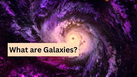
Navigating through the vast cosmos of software dependencies can feel like exploring an expansive universe. The ‘Software Galaxies’ project attempts to bring this metaphor to life, presenting software packages and dependencies as star clusters within a galaxy. This stunning visualization, although impressive and ambitious, has sparked a mixture of awe and critique among its users. While some find it an enchanting window into the software world, others struggle with its navigation and usability, particularly on mobile devices. Let’s delve into the core of what makes this project both celebrated and contested.
One of the first challenges users encounter is the navigation system. For those using mobile devices, the experience can be especially frustrating. The default one-finger touch control often leads to unintended selections, making it hard to pinpoint specific stars or clusters. Additionally, the gyroscope-based orientation control, while innovative, can feel overly sensitive and hard to manage. Users have shared their struggles with keeping steady movements or dealing with automatic zoom actions that trigger unexpectedly. Despite these issues, there is a consensus that the visual appeal is undeniable. A user mentioned, ‘navigating the galaxies is hard, but the aesthetic is quite mesmerizing’ – a sentiment that resonates with many who appreciate visual artistry but seek practical solutions.
Desktop users, on the other hand, seem to have a slightly smoother experience, benefiting from traditional W-A-S-D keys combined with arrow keys for movement. This setup allows for a more controlled exploration of the galaxies, especially when zoomed out. However, even on desktops, there are still critiques about sensitivity and usability when navigating closer to the clusters. One user suggested integrating a game controller-like interface to improve movement, highlighting the need for more intuitive control mechanisms. This suggestion reflects a growing desire for more ergonomic and user-friendly interfaces in complex visualization tools.
The debate about 2D versus 3D visualization also surfaces prominently. Some users argue that a 2D approach would be more practical for understanding software architecture and dependencies. For example, the size of the dots representing the number of dependents can be obscured due to camera distance, reducing the clarity of the visualization’s information. On the flip side, proponents of the 3D model appreciate the immersive experience, likening it to piloting a spaceship through a star-studded galaxy. They argue that the whimsical and exploratory nature of the 3D interface adds a layer of engagement that typical 2D graphs lack. It’s a classic case of aesthetics versus functionality – both vital but rarely perfectly balanced.
The idea of visualizing software dependencies in a cosmic format isn’t entirely new but taking it to this level of sophistication is remarkable. The project shares similarities with other fascinating tools like Gource, which visualizes git repositories in an organic and visually compelling manner. However, the novelty and complexity of the Software Galaxies project also bring about unique technical challenges and user experience considerations. One of the most notable technical accomplishments is how smoothly it renders countless points even on lower-end computer browsers, probably leveraging WebGL particle shaders. This performance feat, while commendable, still leaves room for improving user interaction elements, particularly on mobile platforms.
In conclusion, the Software Galaxies project serves as a testament to the creative and technical ingenuity in the realm of data visualization. It brings to light the vastness and interconnectedness of software ecosystems in a visually captivating way. However, for it to transcend from a beautiful art piece to a practical tool, it needs refinements in its navigation and usability. This includes addressing mobile usability concerns, considering more intuitive control methods, and possibly exploring a 2D visualization alternative. Regardless, the project opens up exciting possibilities and discussions about how we visualize and interact with complex data structures in the digital age. As the cosmos of software continues to expand, the tools to navigate it will undoubtedly evolve, balancing between being functional and delightful.
Leave a Reply